 Finnian Anderson
View Components, Storybook and Tailwind: The Holy Trinity?
In this post, I’m going to cover the use of some popular open-source technologies, that when combined together provide an extremely powerful developer experience. This will be orientated towards Rails, but it should be possible to swap out View Components with something else for your stack.
Introduction
Before we get started, it may be useful to note that I’ve annotated the sections with their relevant commits in this project’s repository where applicable.
The full repository is available here: https://github.com/developius/view-component-storybook-tailwind-demo
View Components
GitHub maintain a gem called View Component which allows us to encapsulate the styles, logic and JavaScript for a given component. I’ve been using this gem extensively for the past few months and it’s really powerful. No more ad-hoc untestable partials, no random CSS dotted around the app, no JavaScript in funny places.
There’s some great examples of building view components on their site, so I won’t get into that here. I usually use the --sidecar option when generating components to create the SCSS and JS files in the same directory so everything is nicely contained and discoverable.
View Component Storybook
There’s another gem I’ve been using called… view component storybook. It allows us to expose view components in Storybook’s UI, giving us a navigable, configurable library of components available within the app.
The configuration of a story looks something like this:
# source: https://jonspalmer.github.io/view_component_storybook/guide/constructor.html

class HeaderComponentStories < ViewComponent::Storybook::Stories
  story(:h1) do
    constructor("h1", bold: false)
  end
end
This will render the HeaderComponent in Storybook with the given properties (h1 and bold: false).
It’s also really easy to add user-configurable options via controls. Using this will allow the Storybook viewer to control the attributes being given to the component. I’ve utilised this extensively and really like defining variants of components using constants, then pass these as the available options to Storybook’s controls.
TailwindCSS
I’ve been using TailwindCSS for a few projects recently and really like the utility class convention. There’s a split in the community around this at the minute which I won’t stir up in this post, so just know you can swap out Tailwind with whatever you like, this approach of VC + VCS still applies.
I’m not going to cover setting up Tailwind below, but I usually just go with the tailwindcss-rails gem which has worked out-of-the-box every time I’ve used it.
Setting up your application
Configuring these three components for a Rails application is pretty straightforward.
I’m starting a brand new Rails project using the
mainbranch here and Ruby 3.0.2, but the steps should be similar, if not identical, for an existing application. As I’m using Rails 7, the default webpack configuration is no longer present and the app will be setup using importmaps instead. This will not allow you to configure Tailwind by default. If you need this feature, you must use the webpack approach instead.
Step 1 - install View Component gem
Commit: 79d9e8c
Following the instructions from the View Component website, we add this line to the Gemfile
gem "view_component", require: "view_component/engine"
and run bundle
Step 2 - install View Component Storybook gem
I think there’s a step missing from the VCS documentation, which is to actually install the gem by adding this line to the Gemfile:
gem 'view_component_storybook'
You’ll also need the @storybook/addon-docs package to be installed, otherwise you’ll get 404s when running yarn storybook.
Other than that, follow their guide.
Step 3 - create a new component
Commit: c0ddb06
I’ll use this command to create a new component:
bin/rails g component Button title --sidecar
I’m going to update the ERB template for this component to render a simple button:
<div data-controller="button-component--button-component">
  <%= button_to title %>
</div>
I like to use
attr_accessor :titlein the component Ruby class to correctly setup thetitlemethod here, rather than using the@titleinstance variable. This comes in handy when using VC slots.
Finally I’ll create the story file which tells view_component_storybook what JSON to generate for Storybook:
# test/components/stories/button_component_stories.rb

class ButtonComponentStories < ViewComponent::Storybook::Stories
  story :default do
    constructor(
      title: text("Button title")
    )
  end
end
Once this is done, we need to generate the json with this command:
rake view_component_storybook:write_stories_json
VCS doesn’t yet have a watch option where it rebuilds the JSON when the story changes, but I think that might be coming soon judging by this PR on their repo.
Step 4 - run the Storybook UI
Commit: bc68b7c
There’s one final configuration change you need to make before this all works, which is to allow the Storybook UI to call the Rails application to render the components. To make this work, a CORS policy must be configured allowing the two applications to communicate on different ports. You’ll need the rack-cors gem to be installed:
gem 'rack-cors'
Now add this config to development.rb:
config.middleware.insert_before 0, Rack::Cors do
  allow do
    origins '*'
    resource '/rails/stories/*', :headers => :any, :methods => [:get]
  end
end
I also tend to enable this in production review apps too by checking if ENV['HEROKU_APP_NAME'] is present, as this makes it super easy to collaborate on designs with other people.
Finally, boot your rails server and (in a separate process) run:
yarn storybook
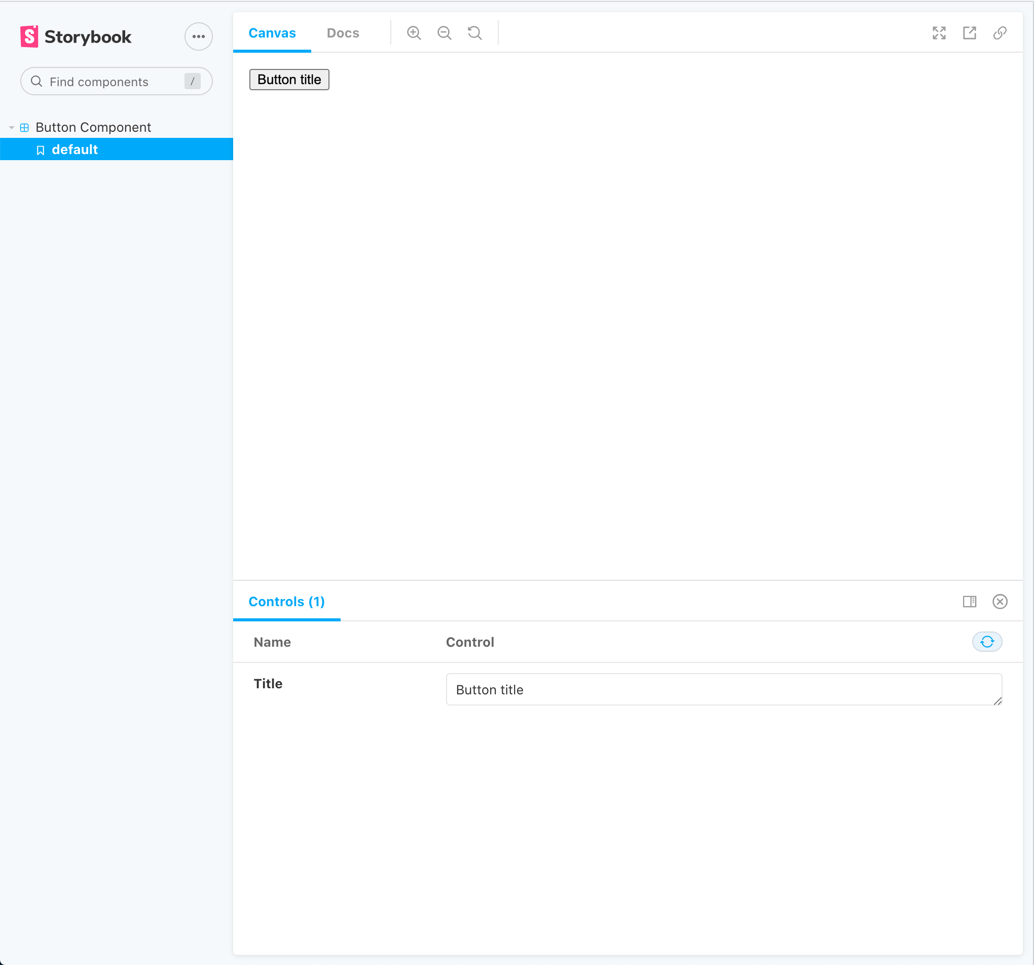
If everything is configured correctly, you should see something like this!
Step 5 - deploying to production/staging
Commit: b9f9c1a
In production, you don’t run the development server of Storybook (yarn storybook) but instead you can build it into Rails’ public/ directory so that it automatically becomes available at /storybook without any additional configuration.
Here’s the command I use for that (which I map to storybook:build in package.json):
build-storybook -o public/storybook
When you boot your Rails server, you should be able to access the Storybook UI at localhost:3000/storybook/
Note: that trailing
/is important as Storybook uses relative URLs for it’s assets. If you don’t include the/, the UI won’t work and you’ll see 404 errors in the Network tab. I’d recommend adding a redirect to your routes to prevent accidentally hitting the wrong path.
To make all this work on a production app, just include the CORS policy, configure your CD to run the storybook:build command and you should be sweet. We use this in our Heroku review apps and it works just fine. To get the custom command to run on Heroku, we went with the heroku-buildpack-run buildpack.
Once your app has deployed, try going to /storybook/. You should see your Storybook UI.
If this doesn’t work, you’ll need to add this configuration for production:
config.view_component_storybook.show_stories = true
It would be sensible to wrap this in the same environment check that we previously did for the CORS policy, to prevent this actually working on production. Why? You probably don’t want users being able to render components with arbitrary parameters as this is potentially a security issue, or could leak sensitive information depending on what you’re rendering in those components.
Wrap up
I’ve been using this setup across 3 different projects now and it works extremely well in my experience. There’s a couple of small grips, namely:
- As previously mentioned, it would be great if we could reload Storybook automatically when we change the story Ruby code
- Getting the CORS policy and various flags correct is finicky and easy to get wrong although relatively simple once you understand what’s going on
- The docs for VCS lack in a few places and are wrong in others, although are definitely improving for sure. I’m intending to submit a couple of PRs for some of the things I mentioned above
- It would be great to have a
--storiesoption included by default when generating new components, but I think that might require monkey-patching the main VC gem so that’s probably undesirable.
Other than those, I love this setup. It’s super simple once you know how it works and is very flexible. Let me know what you think on Twitter (@developius)!